D&AViz lite
Transforming Raw Data into Vibrant Visuals: A Guide to Effective Data Visualization In today's data-driven world, transforming raw data into vibrant visuals is essential for effective communication. By utilizing data visualization techniques, you can present complex information in a clear and engaging manner. This guide will explore the key strategies for creating impactful visuals that resonate with your audience. 1. Understand Your Data Before diving into visualization, take the time to understand the data you are working with. Identify key trends, patterns, and insights that you want to highlight. This foundational step will guide your design choices and ensure your visuals are meaningful. 2. Choose the Right Visualization Type Different types of data require different visualization methods. Whether it's bar charts, line graphs, or infographics, selecting the appropriate format is crucial. Consider the story you want to tell and choose a visualization that best represents that narrative. 3. Keep It Simple Simplicity is key in data visualization. Avoid cluttering your visuals with unnecessary elements. Focus on the most important data points and use whitespace effectively to enhance readability. A clean design allows your audience to grasp the information quickly. 4. Use Color Wisely Color can significantly impact the effectiveness of your visuals. Use a color palette that is both appealing and functional. Ensure that colors are used to highlight important data and maintain consistency throughout your visuals. 5. Incorporate Interactive Elements Interactive visuals can enhance user engagement. Consider incorporating features such as tooltips, filters, or clickable elements that allow users to explore the data further. This interactivity can lead to a deeper understanding of the information presented. 6. Test and Iterate Once your visuals are created, gather feedback from your audience. Testing different designs and formats can provide valuable insights into what works best. Be open to making adjustments to improve clarity and engagement. By following these strategies, you can transform raw data into vibrant visuals that not only inform but also captivate your audience. Embrace the power of data visualization to enhance your communication and drive impactful results.
AI Project Details
What is D&AVIZ?
An AI marvel transforming raw data into vibrant visuals.
How to use D&AVIZ?
Seamlessly upload Excel/CSV files, query the tool, and witness pie, donut, or linear graphs materialize, decoding complex data into actionable insights for informed decision-making.
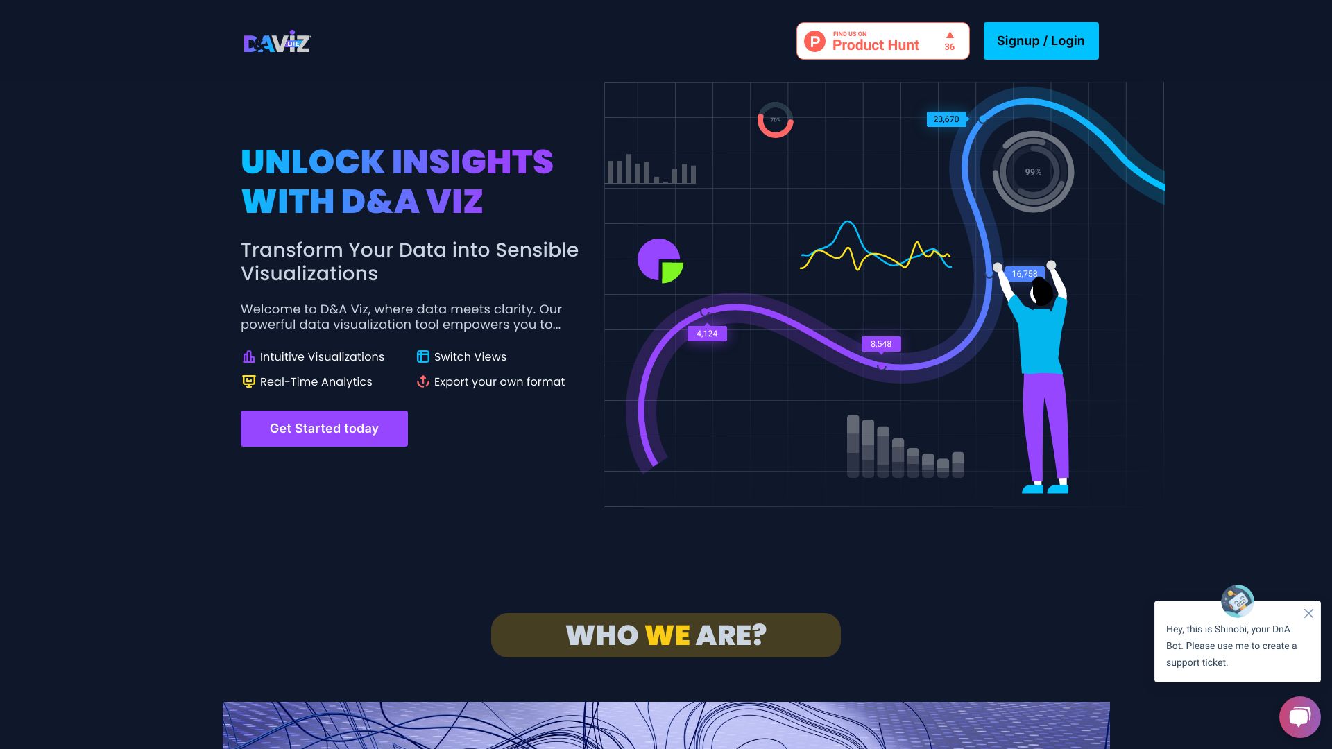
D&AVIZ's Core Features
- Intuitive Visualizations
- Real-Time Analytics
- Switch Views
- Export your own format
FAQ from D&AVIZ
How do I upload data to D&AVIZ?
Simply drag and drop your files or use the upload button to get started.
Can I customize the visualizations?
Yes, D&AVIZ allows you to tailor your visualizations to meet your specific needs.
How can I share my insights?
You can easily export your visualizations or share them directly through the platform.
What are the benefits of visualizing data?
Visualizing data helps in understanding trends, patterns, and insights that are not easily discernible in raw data.
How can I contact D&AVIZ for support?
For support, you can reach out via our contact page or email us directly at [email protected].
D&AVIZ Company
D&AVIZ Company name:
Arivu IQ, Corp.